
The 1929 stock market crash became the benchmark to which all other market crashes have been compared. The following graphs of the crash of 1929 and the Great Depression that followed, the dot-com crash, and the stock market crash during the Great Recession show several interesting similarities in the anatomy of the world’s greatest financial train wrecks. They also show some surprises that run against the way many people think of these most infamous of crashes.
Graphing the 1929 Stock Market Crash
The stock market roared through the 1920’s. Building construction, retail, and automobile sales advanced from record to record … but debt also climbed as a way to finance all of that. This crescendoed in 1929 when the stock market experienced two particularly exuberant rallies about a month apart (one in June and one in August with a plateau between).
Then retail, housing and automobile sales started to fall apart.
Sound familiar?
Keep reading….
(The pattern is similar to what I described in my recent article, “Irrational Exuberance During Trump Rally Exceeded All Records! We’re sailing into a massive stock-market crash.“)
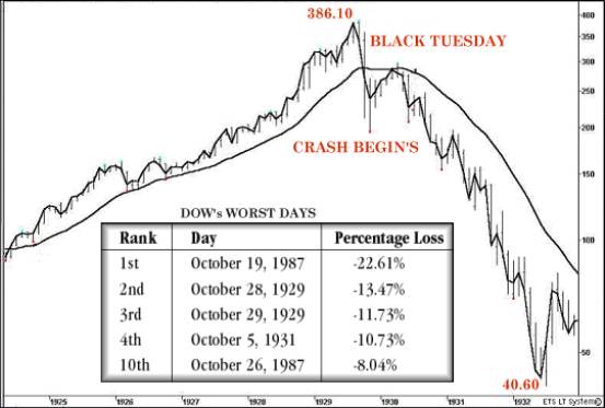
After the Dow peaked in ’29, it traded sideways for half of September and then took a fairly steep drop in the remaining half; yet, it recovered almost half of its fall during that infamous October, before rounding off quickly and plunging to its near death on Black Tuesday.
People tend to forget or not notice that even the infamous Black Tuesday crash on October 29, 1929, dog-legged back up the next week quickly and then crashed even harder over the next two weeks. Bouncing back up to its October 29 bottom, it stabilized, at a point down about 120 points from its peak, which meant the market recovered to a point about 33% below its summit. At it’s worst point that year, it was down 44%.
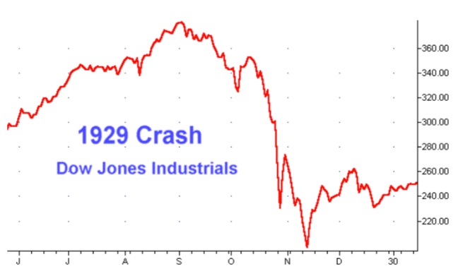
Graph of the Dow during the 1929 stock market crash
“Black Tuesday” or the “Crash of 1929” was just the most infamous of the plunges that took the world into The Great Depression. People also tend not to be aware of the fact that the market first experienced a “Black Thursday” the week before the infamous plunge. So, let’s dissect the anatomy of the 1929 stock market crash in a little more detail.
The bigger picture of the 1929 stock market crash – The Great Depression
First, you can see the two particularly exuberant rallies during the summer that preceded the 1929 stock market crash a little better in this graph:
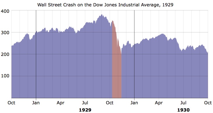
The 1929 stock market crash warned of its arrival with a foreshock in March when the Federal Reserve warned about rampant speculation (“irrational exuberance” during which people believed the bull market would last forever because the bull market had been running for nine years during which time, the Dow increased in value tenfold). The Fed’s proclamation created enough of a shock, tiny as it appears on the graphs above, that National City Bank announced it would provide $25 million in credit to arrest the slide. While that event is an almost unnoticeable blip on the graph above, it was a foreshock of problems that would develop into something enormous, and it was arrested only by bank intervention with what was serious money at the time.
A larger foreshock came in May, but the market went from that second event directly into its steepest rally — this in spite of the fact that construction was already cooling down and auto sales were tanking, and consumer had climbed a high wall of debt.
Wikipedia provides a good overall history of the crash of 1929, including the overzealous optimism and how that optimism fell apart before the big crash. People tend to think optimism continues in some monolithic form unabated until the exact day of a crash; but in 1929 people began to worry clear back in March. Those worries grew intense by September, but the many worries didn’t stop the market from climbing and didn’t stop the permabulls from making stupid proclamations like “Stock prices have reached what looks like a permanently high plateau.” When the market made its first major break in September, becoming severely unstable, many saw even that as a “healthy correction,” failing entirely to see how bad things would become in spite of the obviously shoddy economic fundamentals building up in many parts of “Main Street.”
The Black Tuesday event actually took an entire month with that Tuesday simply being the worst of many bad days. After that horrible October, you can see in the graph above that the market slowly recovered almost half of its losses over the course of about half a year. Many thought the worst was over, but the worst was yet to come. From there, the market began a long jaunt downhill into the belly of the Great Depression, which ultimately graphed out to looked like this:
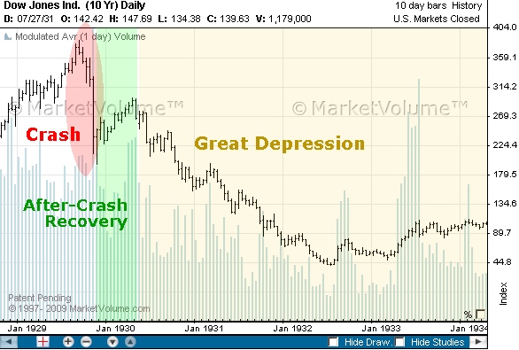
As you see, MUCH worse was yet to come. The Great Depression looks more like a run of steep rapids, and its biggest drop on a percentage basis did not happen until 1932! (See logarithmic chart below. The value of looking on a percentage basis (logarithmic) is that a 100-point drop in the market means you lose half of your money if the market was only at a total of 200 points; but when the market is at 20,000 points, a 100-point drop is only a loss of half of one percent of your money. So, the percentage of the market lost in each drop can be more important than the actual number of points lost. On the other hand, it’s also easier to experience large percentage changes when you are working with something small than with something extremely large. That’s true in all endeavors, so looking at things logarithmically is not always the best way.)
The belly of the Great Depression saw a stock market that had finally fallen by twice as much as the initial crash. The bear market lasted three years, and the market didn’t recover to its previous peak until twenty-five years later!
Logarithmic chart of the stock market crash of 1929 – Dow Jones Industrial Average (DJIA)
The market didn’t fall, go flat and then fall again. Every time it crashed, it bounced way back up and then fell harder — two steps down, one step up; two steps down, etc. (For regular readers, when I have talked in the past about the coming “Epocalypse,” I’ve been talking about the full run of waterfalls and rapids all the way to whatever the final bottom will be, not the first crash; and I’ve been talking about the entire global economy, not just the New York Stock Exchange, which isn’t even the entire US economy.)
When you look at the Great Depression, you can see that the greatest stock market crashes cannot be assessed by their first drop over the edge. These crashes are far greater beasts that are the sum of many falls. The enormity of any major crash cannot be appreciated until years after it began. To see how that is so, let’s compare the 1929 stock market crash to the more recent major collapses that more people are personally familiar with, particularly the Great Recession (being closest in global impact to the Great Depression), but first the dot-com crash.
The dot-com crash
It was in the lead-up to the dot-com crash that Alan Greenspan coined the term “irrational exuberance” in speaking of his concern that the market may have been overheating. Greenspan called it that because the market turned into a feeding frenzy where everyone wanted in because it looked as if the bull market could never end. Anyone should be able to see that such thinking is completely irrational, but somehow the majority of people actually don’t. In fact, Greenspan coined the term in December of ’96, long before the greatest level of euphoric bidding was seen. Even when he coined that phrase, he had no idea how overheated the market would actually become as it continued to climb into the sun and then melt like Icarus.
Just as one can see in the graph of the 1929 stock market crash, at no point during the period graphed prior to the dot-com crash did the market ramp up as steeply for as long as it did just before the crash. In fact, just as in 1929, the market rally showed two particularly steep bursts of euphoria with a brief plateau between them. Just as in ’29, it was as though the market sprinted as fast and as high as it could, stopped to catch its breath, and then made one final leap upward toward its summit.
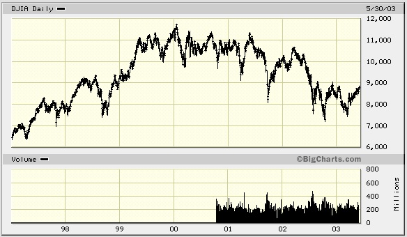
Graph of the dot-com stock market crash
You can also see clearly in graphs of both stock market crashes that the big plunge that became most identified with that particular crash did not happen right after the irrationally exuberant rally. In the case of the 1929 stock market crash, the big plunge came a month-and-a-half after the market’s peak. In the case of the dot-com crash, it came more than a year-and-a-half after the market summited. There was plenty of warning that the bull market was falling apart, but the majority would not see it.
Also, just as in the 1929 stock market crash, the biggest plunge of the dot-com bust happened in the fall. In fact, three of the biggest drops during this three-year breakdown happened in September or October (with two of them being in October, as was the case in the 1929 stock market crash). It seems the market loves a good October surprise when it comes to its worst breakdowns. August and September tend also to be bad months.
Just as with the Great Depression, the dot-com bust played out in a series of major plunges over the course of years before the market finally found its bottom. In neither case was the great “crash” a relatively straight line of decent to the bottom. There were many attempted-and-failed rallies along the way. As with the 1929 stock market crash, the first plunge in the dot-com bust-up wasn’t even the biggest. Although in 1929, Black Tuesday came only a couple of weeks after the first big drop, during the dot-com collapse, the biggest plunges over the cliff would be either the fourth of fifth of the major drops (the fourth being the steepest, the fifth being slightly longer in duration).
What the dot-com bust made most clear is that the nation’s biggest stock market crashes are not airplane slams into the ground with a burst of flames but slow-motion train wrecks. That is to say, they happen over a protracted period. That’s not immediately obvious in our memories because when we think of them, we tend to label them by the most horrifying plunge that really got everyone’s attention.
You can also see that people had a major warning of the dot-com bust in the form of a huge foreshock in late Summer and early fall of 1998. As with major earthquakes, there are always foreshocks and aftershocks that play out for months around these big shakeups. You’ll also see the foreshocks and aftershocks confirmed in the anatomy of the our nation’s second-most memorable stock market crash:
Graphing the stock market crash of 2007-2009 – The Great Recession
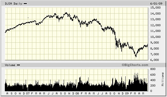
Graph of the Great Recession Stock Market Crash from 2006 to 2009
From this graph, you can see that the Great Recession stock market crash — the closest equal in overall impact to the Great Depression — started in much the same manner as the 1929 stock market crash and the dot-com bust. Once again, the market experienced its steepest run-up in a burst of glory just before its peak. In all three crashes, that run-up came out of a minor valley, almost as if that first drop before the summit was a bit of a foreshock. The run-up to the summit is always a steeper sprint than the market saw for many months/years prior (hence “irrationally exuberant” because its climbing faster than makes any sense, given that the market is really about to break and that economic fault lines, such as declining auto sales and declining housing sales are starting to show). The market seems to only summit after staging a last hurrah.
There is a slight difference between the 1929 crash and the financial crisis of ’07-’09. In ’07 the market experienced a single two-month-long rally of irrational exuberance from April through May of 2007, and then it bounced along mostly sideways through June, attempted an even steeper rally in August followed by its first plunge in late August. Maybe that is not that different; it’s just that the breather between the two bursts of exuberance was a little longer.
A more notable difference is that the first peak after the rally proved to be a false summit. After a fairly significant drop, the market recovered to an ever-so-slightly-higher peak before it began its years-long cascade to the bottom. It’s not higher enough to mean anything. It is more like the market this time experienced twin peaks. The market’s extended and bouncy top took five months from the end of the exuberant rallies and from the market’s first peak to hit this second peak. What this shows in a clearer way is that even after the exuberant rallies, the market may bounce along a top for quite a long time before it finally moves irreparably down in a decline that will be devastating for years.
The market’s first minor drop into what became a downhill run of many years happened in October with a minor attempt at a rally and then a deeper plunge at the start of November. This time, October wasn’t one of the big plunges, but it was the turning point so still very significant in the anatomy of this crash.
Again, the first drops were also nowhere near the biggest. The market took a deeper plunge still in January of 2008, an even deeper but more protracted fall in June and July of 2008, but the infamous plunge that this stock-market crash is most remembered for didn’t happen until the fifth plunge after the first summit of its twin peaks. As if to prove the rule, that notable crash happened in October, a year after the market’s bearish run began. While the market made its initial downturn in the first October, it fell completely over the cliff on its second October.
Similar to the Great Depression, the market’s total crash took numerous months to reach its bottom and saw many failed rallies along the way. Just when people thought the market was finally bouncing along its bottom, it took one more enormous one-month plunge to find its absolute bottom, just as it did in the Great Depression.
What are the similarities and differences of major stock market crashes?
Only when you compress all of these crashes into a chart covering the full life of the Dow (and I use the Dow because it has the longest history of the major indices) does it appear that each crash happened in one massive plunge:
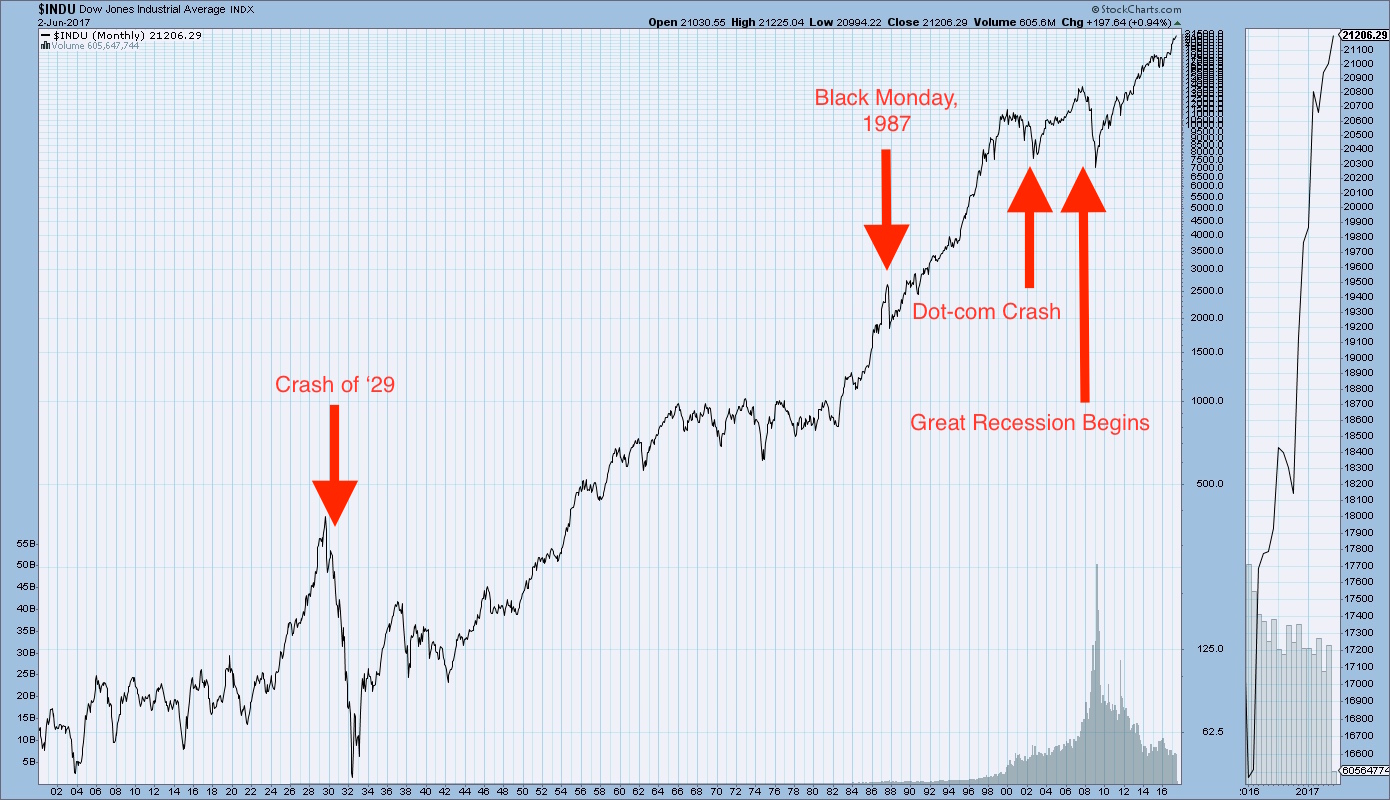
Logarithmic graph of all stock market crashes on the NYSE from 1900 to present.
The truth about major stock market crashes is that months stretch on into years before the crash has fully played out. Their most memorable leaps off a cliff also happen somewhere after the initial decline — often way after — and there is always more than one major plunge. So, we talk about the crash of ’29, though there were two major crashes and many plunges in the Great Depression. We talk about Black Mondays or Black Tuesdays because we like days that put a handle on things for ready reference, but the more accurate picture is years of ups and downs with the downs always being larger than the ups. Really, the most notable thing is how long these bear markets run and how far they fall during their series of cascades to the bottom.
In summary, really big crashes do round off first. In 1929, the round-off was short, but in other cases, the top has taken many months. The first drop is usually minor, while the first plunge over a cliff (even when it is as infamous as 1929’s Black Tuesday is … 1) only one of many, and 2) not necessarily the worst of the many falls (especially as a percentage of the market’s total value). The total “crash” is always broken up by bear-market rallies that, at the time, cause people to think the bottom is in, and the “crash” is a train wreck takes years to play out. These crashes only look like a single major event when you compress them onto a century-long chart.
Histories of the world’s worst stock-market crash:


